Sena Bakir
User Experience Designer

Heuristic Evaluation for KIA Canada
Client: KIA Canada
Reported By: Hatice Sena Bakir
Report Date: 24/09/2020
Skills: User testing, Design research, User Interface
Overview
In this report, we will be classifying the findings for Kia’s website in terms of usability and evaluate the severity of the findings for their importance.
1. Visibility of System Statues
When the user is on live 360-degree screening, waiting time for selecting the color of the car is too long.

Importance: Important Usability Issue
Recommendation: Reducing the waiting time in order to keep the users on the website
2. Match between system and the real world
Phrases and concepts are not familiar to the user. Example: SX Turbo or UVO intelligence which is written in the details.


Importance: Important Usability issue
Recommendation: Writing more explanatory phrases that everyone can understand
3. User Control and Freedom
When the user press “Undo”, website brings the user to the main page instead of bringing to the previous page.

Importance: Important Usability Issue
Recommendation: Better user control by giving the opportunity to see previous page by clicking “Undo”
4. Consistency and Standards
When the user clicks on “More options” button, that is under Pricing and Next Steps page, all options for cash price, financing and leasing becomes visible too.


Importance: Medium Usability Issue
Recommendation: It would be better if only the relevant information section appear when the user only need that specific information
5. Error Prevention
No error prevention messages seen anywhere in the website.
Importance: Medium usability Issue
Recommendation: It would be better if there would be a system showing errors or warning boxes before selecting the choices in order to eliminate wrong selections
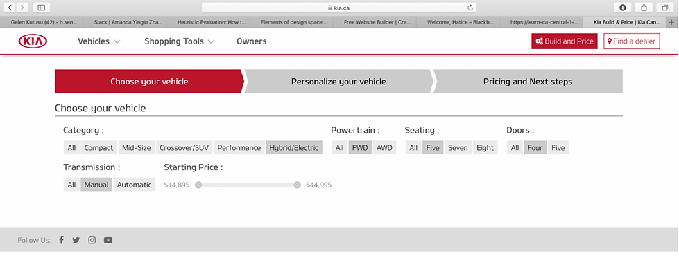
6. Recognition rather than Recall
No visible reset option seen for the filter.

Importance: Important Usability Issue
Recommendation: Applying an option to reset filters to the website would be very efficient for users in terms of searching another type of car in shorter time
7. Flexibility and Efficiency of Use
No shortcuts like arrows which brings you to in a specific page which is visited before.

Importance: Low Usability Issue
Recommendation: It would be more efficient for users to include shortcuts while playing around in the website
8. Aesthetic and Minimalist Design
Irrelevant information under “Next Steps”. Example: Sign-up for details. Unnecessary elements distract users from the information they really need.

Importance: Important Usability Issue
Recommendation: By putting only a sign like “Sign-up for updates and special offer” is enough to make users see that choice. It would be better if the unfilled boxes appear when the user clicks on “Sign-up” and the boxes become visible when only user clicks on it.
9. Help Users Recognize Diagnose and Recover from Errors
Website does not give error message when the user filters the specific car that they could not match. When the user filtered manual hybrid FWD car, website did not give any other solution to proceed.
Importance: Medium Importance Issue
Recommendation: Leading the users with other options by putting an error message could led them see other available products instead of leaving the website.
10. Help and Documentation
There is no search button or Help Centre on the page. There is only live chat at the bottom right of the page.

Importance: Important Usability Issue
Recommendation: When the user tries to find the relevant information, it is crucial to have the option to search. It would be much better when user can access to have search option.
Positive Usabilities in KIA Canada Website
-
The same shade of red, white and gray colors is being used
-
360-degree car visuals are like real world designs
-
Process goes smooth/step by step until the pricing section
-
System gives feedback in terms of clicking on the colors
-
There is live chat option at the bottom right side
-
My recommendation for the design aspect would be categorizing the filters vertically under columns. This way the page would have more space and filter options would be more visible